
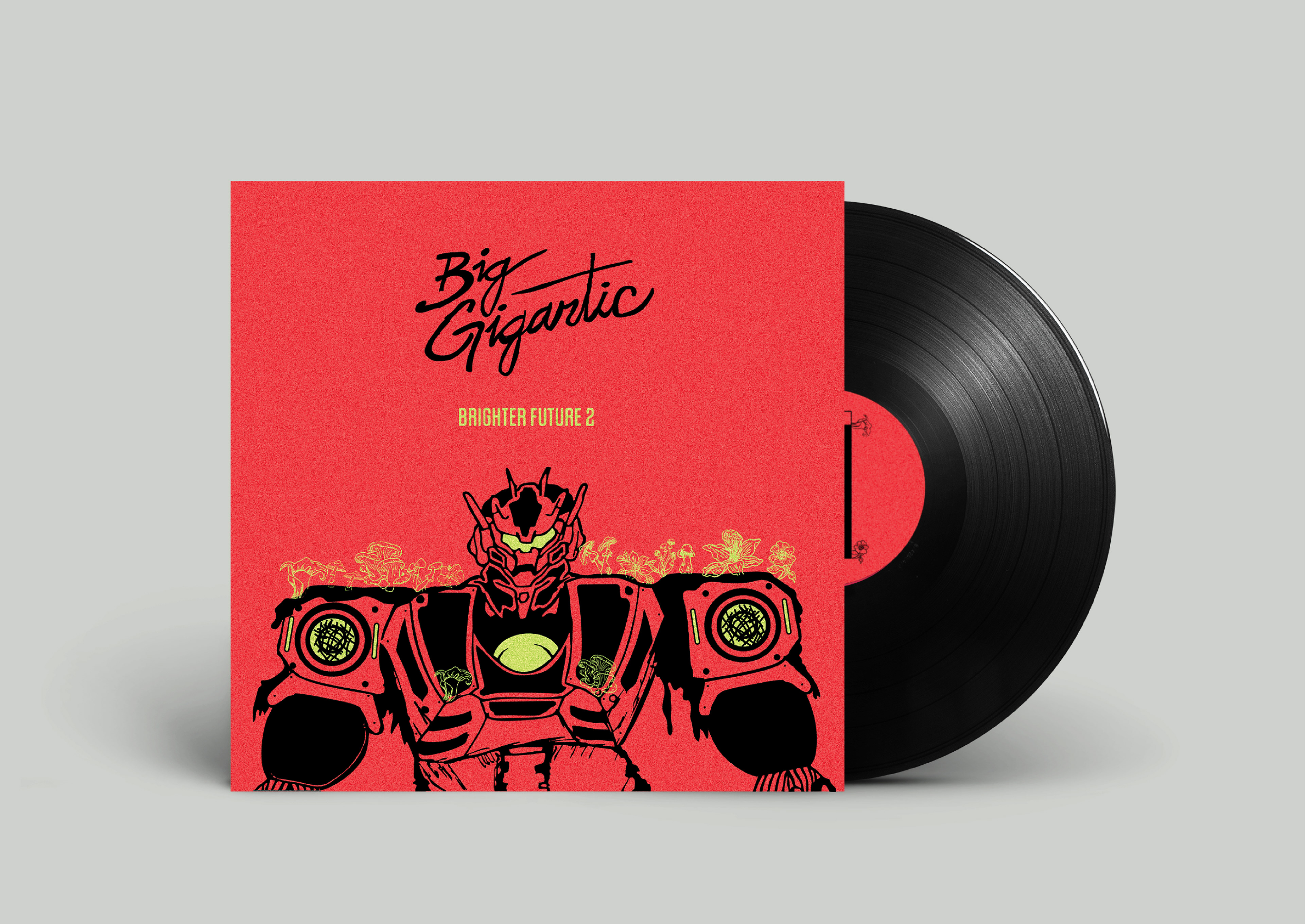
This is an album I redesigned for an upper division illustration class while attending Colorado State University. I listened to this album on repeat to get a feel for the themes and energy of the music. I broke this down into three words: vibrant, naturalistic, and technological. So, I went with a bright, complimentary color palette. Then I combined naturalistic forms with a robot DJ who has speakers built into his arms.
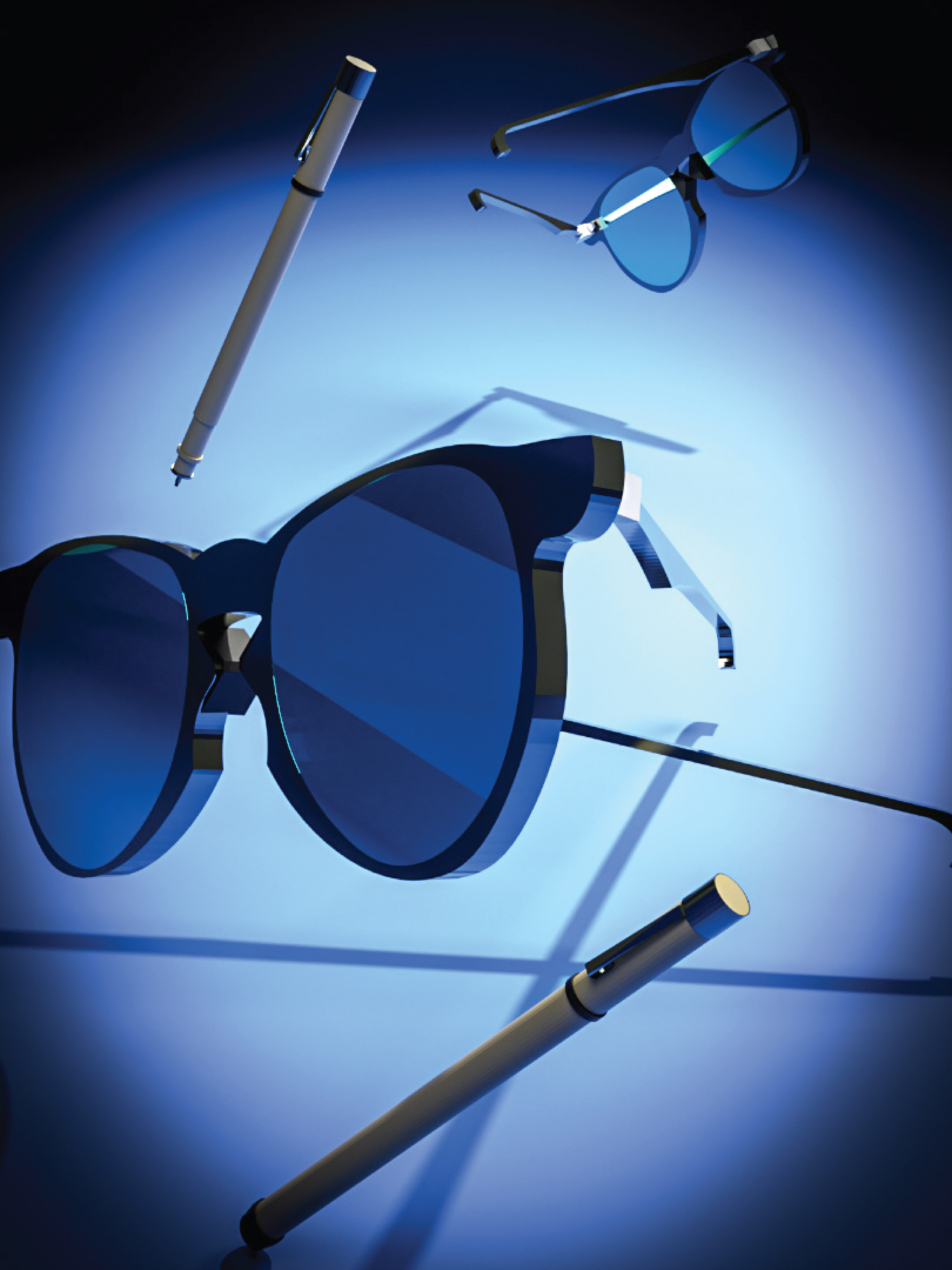
Every designer has their own approach to the creative process. As artists it is something we refine and change over time to maximize our capabilities. To me, the creative process is a routine that has the ability to change for a specific project’s needs. However, I always begin every project with a conceptual idea. To get into this mindset, I put my glasses on to initiate my brainstorming phase. Upon the discovery of the concept, I began sketching with Micron pens. I use Micron pens because they are precise and require me to be intentional with every mark I make. By using pens I also remove the option to erase mistakes and that encourages me to just go for it! For this project I wanted to utilize my skill in 3D modeling to visually represent my creative process. To do this, I rendered 3D models of my glasses and the Micron pens I use! With editing in Photoshop, I was able to make changes to light and shadow to focus the poster toward the center with a vignette and a circular highlight. These visual effects were added to convey the notion that while I create, I’m focused on the process, not the output. The right creative solution I aim to produce will result from my willingness to patiently search for it.
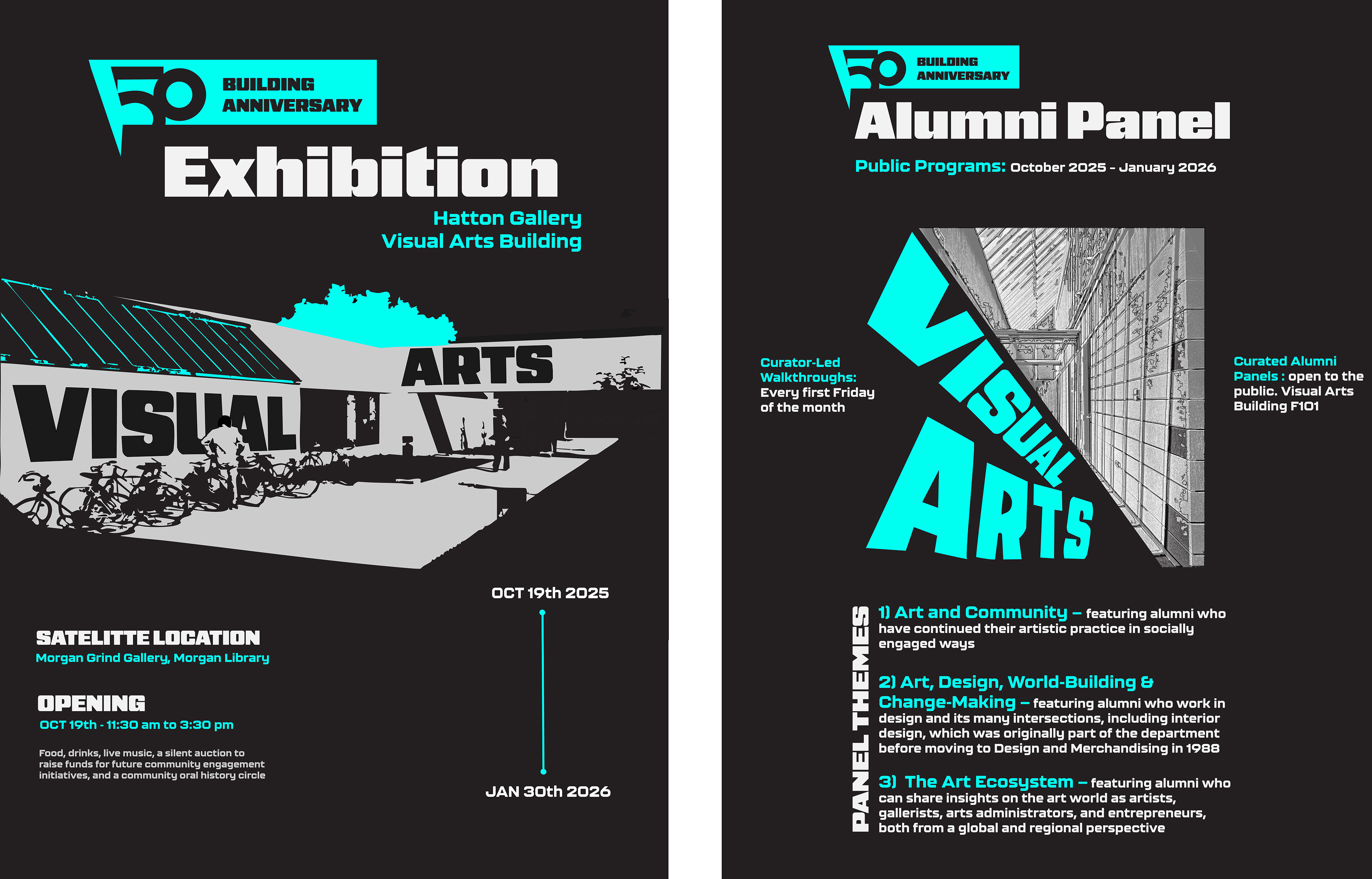
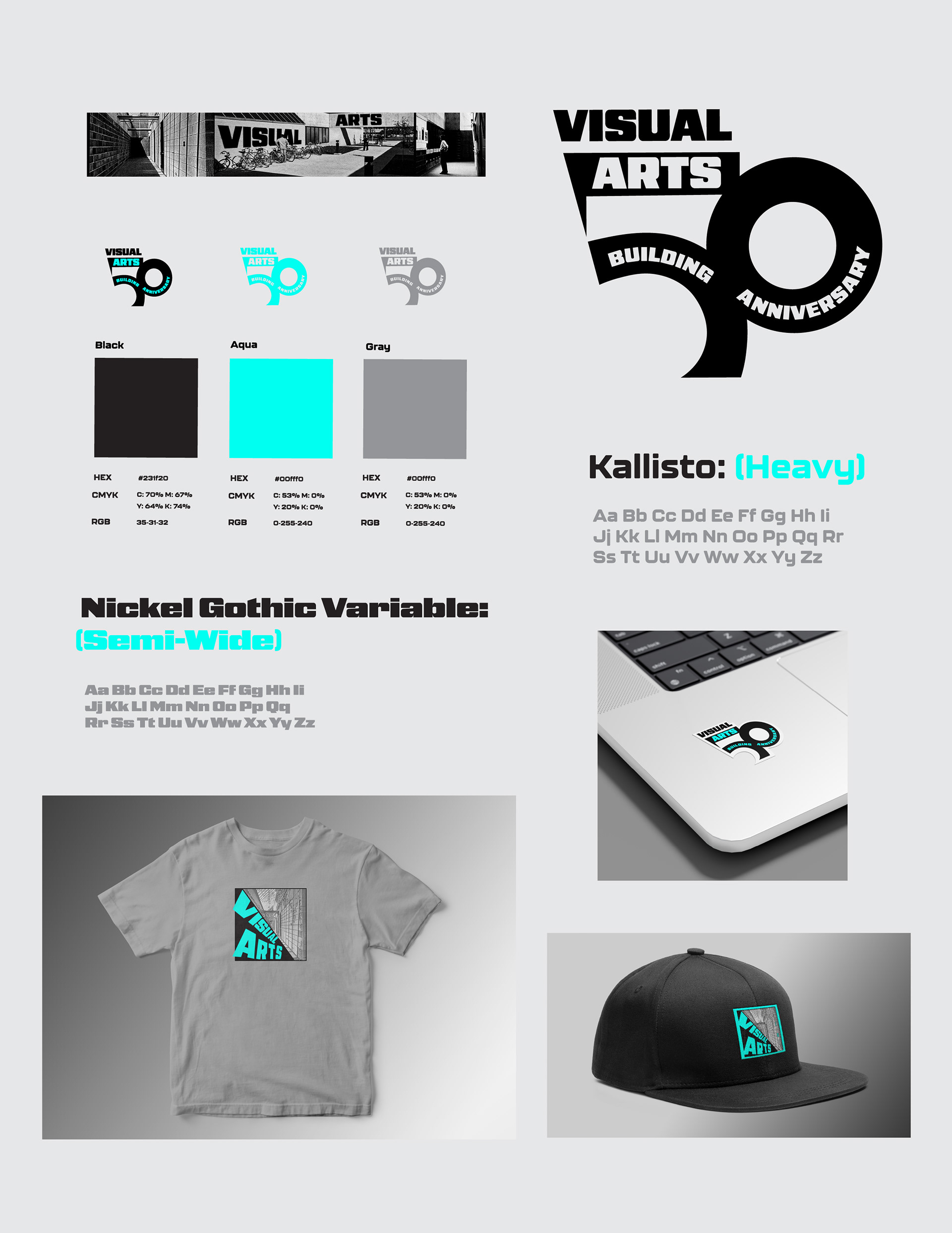
The university I attended, Colorado State has a very unique art building because it was built fifty years ago on a small chicken farm. It was made in a Brutalist architecture style, which is quite unique compared to the other buildings on campus. Less modern and more minimalistic, this one-story building is a hub for artists from a wide range of different mediums. From metalsmithing to fibers to graphic designers this art building is the home of many talented individuals. So, as graphic designers we were asked to create a design system that was both a tribute to the history of the building and a celebration for many years to come. I created vector versions of real pictures in our school archives to show the classic look of the school with a modern technique. In addition, I decided to use bold typefaces to stand out on the posters. This was to get viewers to engage with them and get excited about the 50th anniversary of the art building. For the logo, I went simple with the geometry doing most of the talking because I wanted to emulate the combination of linear and curved shapes the building is made up of.
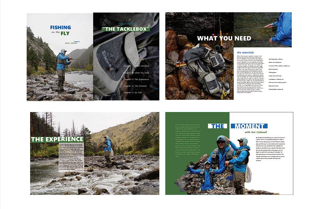
Fishing on the Fly is an example of how I would create a publication. To me, a publication or a magazine has to be about something with layers to it. Fishing is a sport with many complexities but can simplified for beginners like me. I wanted to make a guide that would help more people engage in the sport. Showcasing the places and experiences you have while doing it to help get my community get excited for the fishing season. The purpose of this concept was to create page spreads that used visual language and high-resolution photography for quality results.
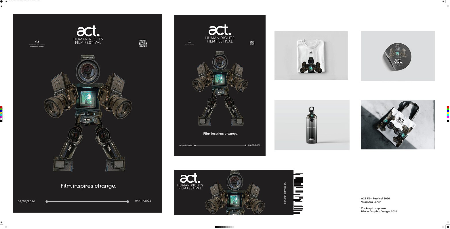
This poster and logo design was for the ACT Human Rights Film Festival. For my design I wanted to create something connecting humanity to filmmaking. In order to do this, I started by deciding the silhouette was going to look like a person. Then, I sketched some conceptual logos, but I didn't think they matched the ACT Human Rights Film Festival. For a while I was puzzled. Then I took some photographs of my cameras at home for inspiration and uploaded them digitally. I made the realization that the cameras could be a part of the logo design, so I took this idea and ran with it. As a motion graphics designer and videographer, I believe people have a special connection to cameras. They help capture moments in time we otherwise wouldn't get to see again and help tell narratives. It's this direct involvement in the process of movie making that make cameras so magical. I wanted to showcase how humanity and cameras work together to create film. To me, film inspires me to be a better human being and get more involved in my community. I put "Film inspires change." on the poster to convey this message in my poster and merchandise proposal.
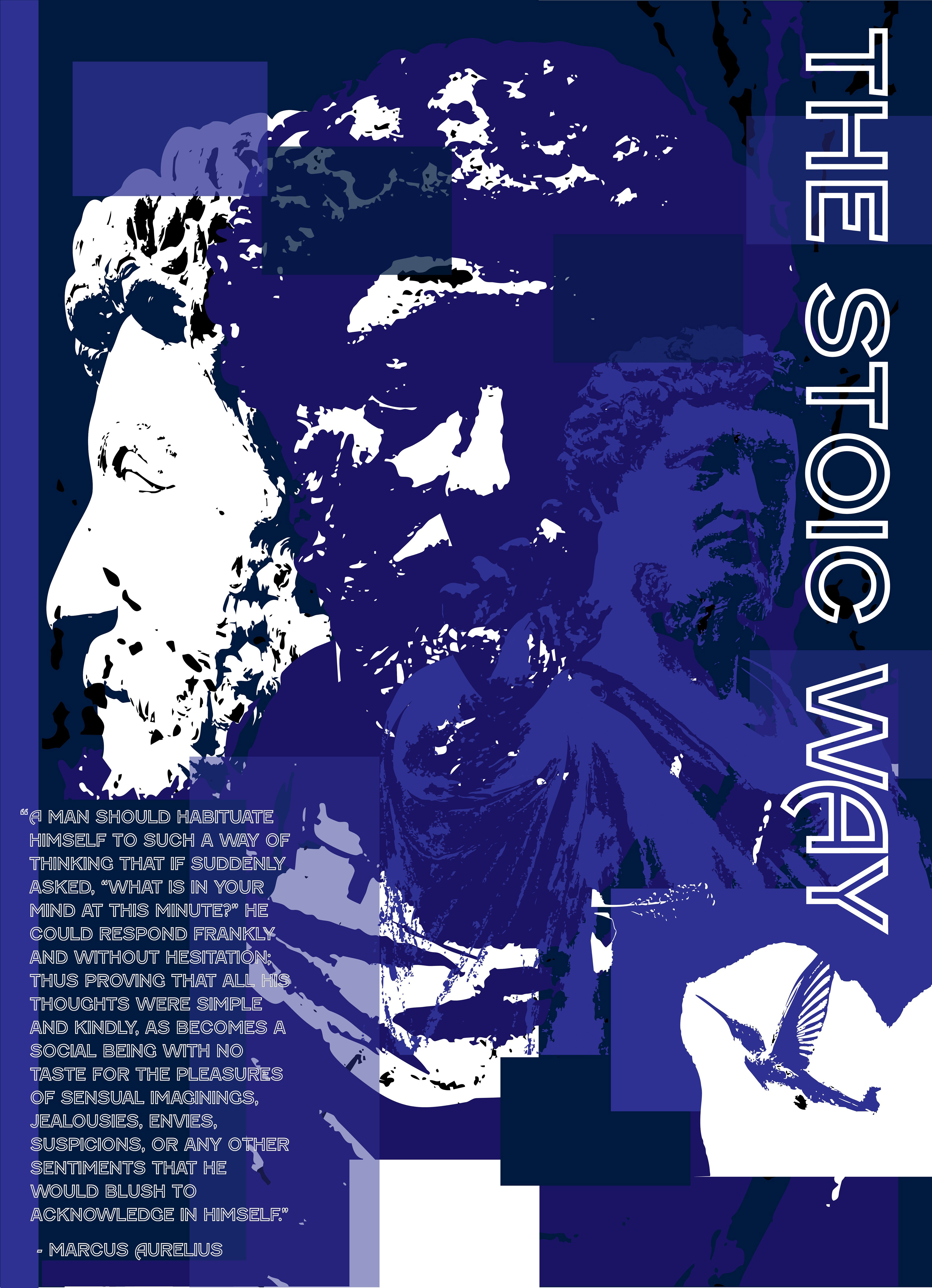
I am a reader of ancient philosophy, and I take a lot of inspiration from the ancient Stoics. Specifically, the emperor Marcus Aurelius is interesting to me because of his story and unrelenting commitment to internal and external tranquility. After reading his journal that was made into a book, "Meditations" it was clear to me that he had a unique and clear perspective of the world around him. He was writing to himself reminders of the lessons and experiences he had during his life. To help him remember the importance of joy and gratitude. After all he was an orphan, and so he was thankful to be in a position of influence. He wanted to make the world a better place. This made him a good leader and philosophical thinker likely due in part to his lack of emphasis on power but rather a care for those around him. This poster is a reminder for me to be more thankful for family, friends, relationships and the experience that life has to offer. As well as to tell me I can change a little bit every day for the better, even if it is difficult or challenging.